In a writing workshop in Port Townsend, Washington I first heard Elizabeth Partridge read a version of Whistling. Her evocative words created beautiful images in my mind. Betsy and I became friends and I heard lots more of her writing, but it was several years before she brought this story out to work on again. In the summer of 2000 I was visiting in her cabin in Mendocino County, California, when she showed me her latest version and asked, "Is it ready to submit to a publisher?"
Again, her words created lovely images of a starry sky changing gradually to glowing predawn colors as father and son acted out the heart-warming story below. But having been introduced to the quilting world through my book, Pieces: A Year in Poems and Quilts, I saw the images in a new way this time. "Yes," I said, "it's ready, but I see it in fabric."
Betsy looked at me a moment and then the light spread across her face in a smile. "Go for it," she said.
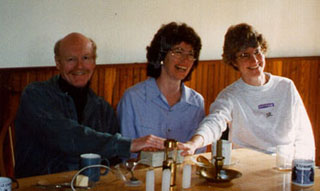
My husband, author Gary Hines, author/illustrator Martha Weston, and author Elizabeth Partridge—Betsy we call her—at her cabin in Mendocino, where she said I could have a go at illustrating her story with fabric. The four of us work together as a children's book critique and support group. We call ourselves The Frosters.
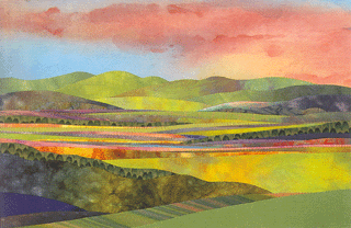
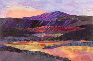
Excited by the prospect of illustrating Whistling with fabric I went, with my mother, to my first big quilt show in Nashville. I was happily buying fabrics with both Whistling and Winter Lights in mind, when I came to the exhibit of quilts by Jo Diggs. Jo does beautiful appliquéd landscapes bathed in glowing light. I was mesmerized. I needed to learn how to do that for the Whistling illustrations. Again and again I came back to Jo's booth until I finally got up the courage to talk to her. She told me she would be teaching workshops in the spring, which seemed much too far away, but definitely something to which I could look forward.
Green Hills, Green Fields © Jo Diggs 2001
Across the Valley © Jo Diggs 2001
Valley Glow © Jo Diggs 2001
More information about Jo's work can be found on her website.
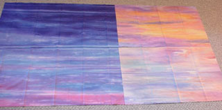
Meanwhile, I got started. I tried getting up before dawn to see the light changes myself. Since we lived in the shadow of a large hill, I'd drive to higher areas nearby, but found that in the valley of the Delaware River, the morning sun was only visible through a foggy haze. I did some searching on the Internet and found lovely sunrise pictures, and I had memories of watching sunrises, particularly over the sound at Port Townsend, Washington.
Opportunities for unhazy sunrise views
near my home at the time, were limited.
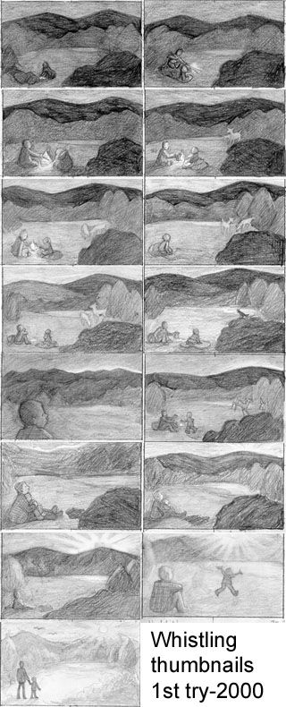
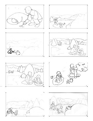
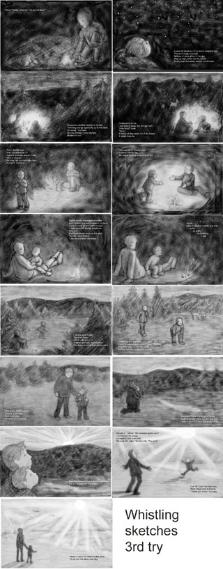
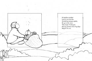
I sketched out a dummy and shared it with Betsy and Martha.
"I love the way the sky lightens," they said, "but the scenes are too static."
"Move in."
"Move out."
"Change perspectives."
"Work on the body positions."
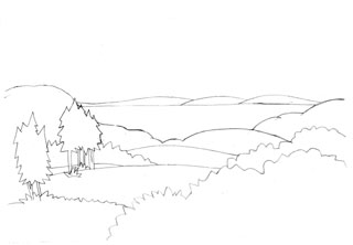
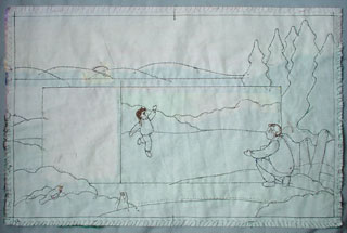
Here are my first sketches:
I needed to figure out just what the fabric could do.
Realizing that the sky fabrics to be consistent through the book I searched out Mickey Lawler's website. I ordered and received some of her SkydyesTM fabrics. The colors were beautiful, but they were sprinkled with sparkles. I was afraid that would be a problem for reproduction, so I contacted Mickey and asked if she had any fabrics with those wonderful colors, but no sparkles.
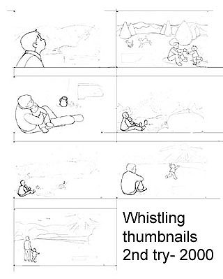
"Explain to me just what you need," she said, "and I'll see what I can do." I sent her a storyboard with thumbnail sketches. She found the time to paint a piece of fabric, about a yard and a quarter, that went from deep blue to beautiful rose. She also sent two other pieces; one with golden glowing tones, and another with pale blues, lavenders, and pinks. Wonderful!
With my samples and growing fabric stash, I was excited, but others said, "What about the reflected light?"
"I can't see the expressions."
"These shapes don't look like trees."
"Where are they?"
"Why fabric?"
"Maybe you could show more if you painted the illustrations."
In November I had a great session with Nanette Stevenson, a former art director who does consultation work with illustrators. She was invaluable in helping me focus on the storytelling and realize that I needed to find a way to tell the story of the light as well as what's happening with Jake and Daddy. She also pointed out that the story had a false climax, which Betsy solved with a rewrite. As had the others, Nanette expressed concerns about my choice to use fabric and thought I should stay open to other media, or investigate painting on fabric.
I did more sketches, playing with the reflected light. To avoid doing all the shading I started experimenting with Photoshop, smudging and cloning to fill areas. Betsy liked these sketches and even suggested I think about doing the book with this technique and forget about fabric altogether.
I thought about it. It was true that fabric was limiting in many ways. Showing reflected light was very difficult if not impossible. I also had the problem of where the text would go. Composing pictures that allow room for type, especially if the story takes place in the dark, is an issue in any medium, but even more so when dealing with textured fabrics. Maybe I could combine the fabric with other media.
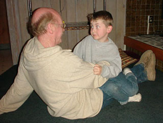
I didn't know what to do. Over the winter, my life got complicated and work on the project was slow. I did some experimenting, and took some pictures of Gary and our grandson Jacob to help me improve the figures, but mostly the project sat.
March came and I went to Jo Diggs's class in Lancaster, Pennsylvania. Again I was blown away by her use of light in appliquéd landscapes. Her lessons helped me see how I could get a bit of that into my work. Choosing fabrics and shapes that could pull the light and color through the pictures was such fun!
When it came to my book, Jo was impressed with my samples. She thought I was on the right track, but didn't know what to tell me about the problems of reflected firelight or how to deal with the need to have spaces for text in each picture. Still I was encouraged.
I took my samples and experiments to Ava Weiss, then my art director at Greenwillow. "Can I do this?" I asked.
"Of course you can," she said. "They are wonderful!"
She liked the plain fabric best, without the addition of Photoshop and colored pencil. She preferred the simplicity of unshaded faces with eye-dots, and liked the folk-art look of the plaids that didn't change sizes when the figures did.
I felt she was the first one to truly see the potential. Ava looked me in the eye and said, "You can do whatever you want."
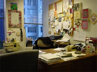
Ava's is now retired but this her office where I rarely saw her sitting at her desk.
Okay. What I wanted was to do pictures that would be so exquisite that people would have to look and look at them, soaking in the beauty. I wanted the pictures to glow with light and sing with the birds at dawn. How could I do that in fabric and still tell the story? How could I make pictures that would make people say, "How beautiful! What a wonderful use of fabric!" I had to do something that only fabric could do, something that would tell the story of the light and the story of the people and still leave room for the text on each page.
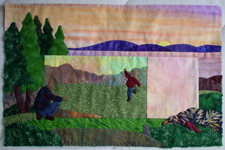
Finally it came to me. I could use blocks, not traditional blocks seamed together on every side, but inset or overset blocks. I love the way some quilters use elements from one block tying in or overlapping another, so what is foreground and what is background becomes ambiguous. I could have blocks for the text and blocks that moved in closer on the figures while still keeping that wonderful changing sky as the background. Some elements could be both in the block and not, both behind and in front of the block, interweaving in an exciting and dynamic whole.
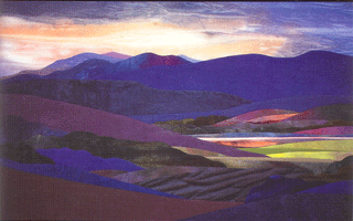
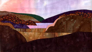
Jo Digg's Mother Earth, Father Sky II is an example of what I mean by inset and overset blocks interweaving the foreground and background.
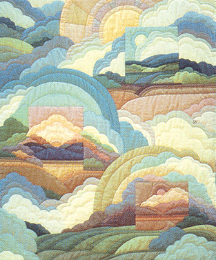
A portion of Mother Earth, Father Sky II © Jo Diggs 1986.
Nearly a year after Betsy had shown me her manuscript, we were again spending a few days together at her cabin in Mendocino. I told her what I'd been thinking and sketched one of the pages. She saw it immediately and was ecstatic. Now we both had a clear vision of what the book could be.
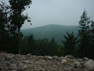
I decided to set the story in the evergreen forests on the west coast, perhaps in the Mendocino County redwoods in California where Betsy has a cabin, and I now have a home, or perhaps in Port Townsend, Washington where we first met. With all the twists and turns of the water on Puget Sound, one can easily see the sun rising over water. Having the sun rise over water, with land on the horizon, was important to helping bring the light into the illustrations. Our water could be in a bay or inlet, or it could be in a mountain lake.
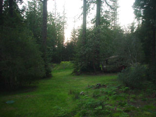
View off our deck at twilight. We weren't yet living here when I made my sketches, but it isn't difficult to see the similarities to the scene I created for the book.
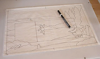
Onto the background I placed boxes for the type and figures. In Photoshop I made a color sketch of one of the line drawings.
Now I was ready for fabric again.
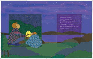
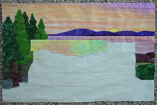
Starting with the third spread, I traced the lines onto a piece of muslin to which I would sew the pieces of my landscape. Then taking a deep breathe, I made the first cut into the deep blue sky fabric.
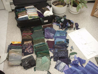
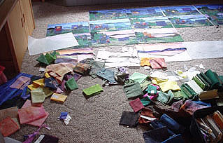
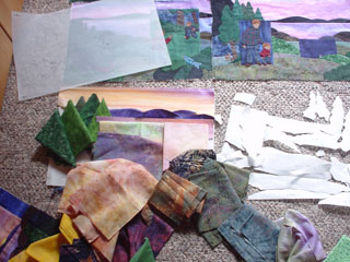
I laid out my other fabrics, arranged by color and from dark to light. Piece by piece I selected a fabric for each hill, rock, tree, and bush, keeping the whole book in mind as I worked.
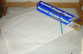
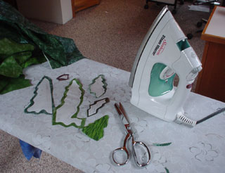
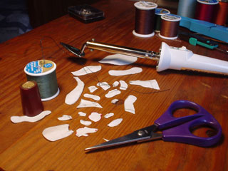
Using freezer paper I made a pattern for each piece of the picture, which I then ironed onto the chosen fabrics and cut out, leaving about 1/4 inch around the edges for turning under.
Finally, sewing by hand, I began to appliqué the pieces onto my muslin guide. I started with the sky, then the hills in the background, the water, the rocks along the edge, and so on, layer by layer.
But if you can't visualize this without pictures, don't worry. Down below my technique is demonstrated with step by step photos below.
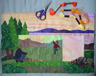
It was important to keep each piece as flat as possible so I worked on a plastic board on my lap.
The plastic board also saved me from sewing the piece to my pants. One of the photos I lost showed me with the piece dangling from my pant leg.
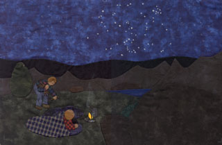
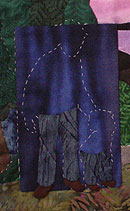
Once all the pieces were appliquéd in place I added detail, stars, hair and facial features, with embroidery.
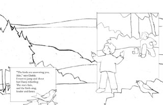
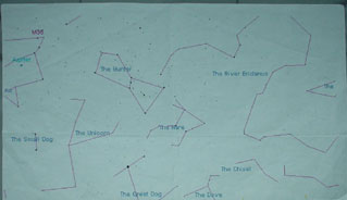
Placement of the stars was important in some of the pictures. Betsy had written in the text that Orion was overhead. Was it possible to see Orion in the sky just before dawn? I asked my husband, an amateur astronomer since childhood. He found MyStars, a software program that would show the sky at any hour on any date in any geographic location in the world. The program showed that in late August and early September in the northern hemisphere Orion is visible just before the sun comes up. Perfect! I marked my fabric and embroidered the stars.
On July 16th, 2001, with my dummy and one spread in hand I went to see Virginia Duncan, my editor at Greenwillow Books. I didn't expect her to make a decision while I was there, but wanted to show her the appliquéd illustration in person. She loved the art and the story too, until the last page. She asked if the author would be willing to revise.
"Oh yes," I assured her. "Betsy is the sort of writer who is still revising after her editor thinks it's done."
Virginia chuckled and said, "Then I'm ready to offer a contract."
We decided to put this book ahead of Winter Lights, my second poetry and quilt collection then scheduled for completion in August 2003, mostly because Whistling was much further along. The revision required seemed simple enough and I had high hopes of that being done within a week or two. In the end the major change basically amounted to a reversal of the text on the last two spreads, but between Betsy's schedule and Virginia's, and Virginia's forgetting that we'd agreed to do this book first, it took more than two months to get it done.
Meanwhile I was chomping at the bit to get going on the rest of the illustrations. After my dawdling for a year, now I was in a hurry. I really hoped to finish the book before our move to California in November, and when it was clear that wouldn't happen, then at least before Christmas. The okay finally came in September and I plunged in.
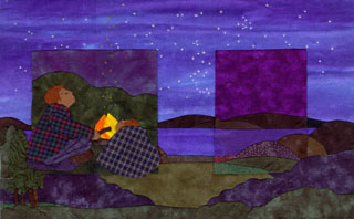
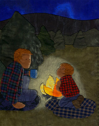
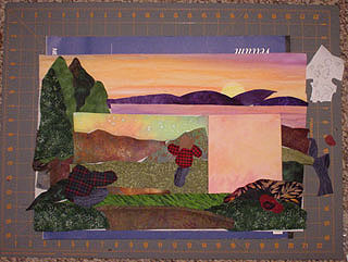
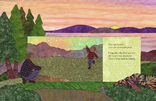
The first completed illustration.
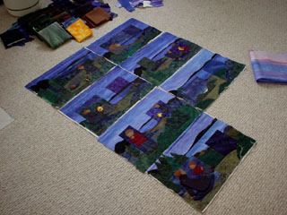
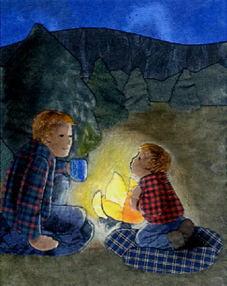
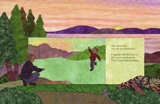
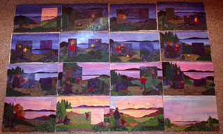
Progress as of October 14, 2001.
Living in a small rented house as we transitioned from Milford, Pennsylvania to Gualala, California, I had few house or garden responsibilities and could work from dawn to bedtime on Whistling.
During September and October I put together the title page and the first twelve spreads. They still needed most of the time-consuming embroidery details, but they were showable.
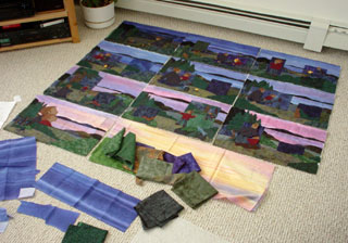
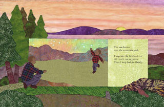
Progress as of November 1, 2001. The second and third spreads were with the publisher for test scans at this point, so I had twelve basically completed. I was working fast.
In early November I took them into New York for one last meeting with Virginia and Ava. They were delighted, but had suggestions for improvements.
They wanted gray rabbits instead of brown, noses on the faces and better whistling expressions. They also felt Daddy's face was too round and young looking in many of the pictures. Ava had done a proof of one of the illustrations, too, and we were both concerned about the buckling in the faces during the scanning process. It created distracting shadows.
Getting comments like these is never easy, especially when you are racing to finish a project. I had a lot of stitches--including embroidered hair--to take out and redo and now it was time to leave for California.
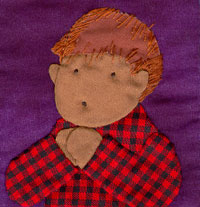
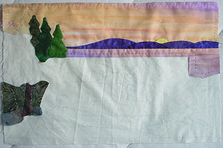
This shows the problem with wrinkling on the faces. I also had to add a nose and fix the mouth so it looked more like it was whistling--not an easy thing to do without looking a bit grotesque.
I had planned to stitch my way across country on our eight day drive as we made our move, but I soon found that it wasn't as easy as I had hoped. I removed a lot of the guide threads and the faces and bunnies that needed to be redone, and added a few stars, but the crowded jostling car and the glaring low winter sun, made it a less than ideal situation for careful stitching.
I did experiment a bit in our motel rooms in the evenings and came up with a solution for the faces, which is to back them with a very stiff iron-on interfacing. They were going to be a lot better.
We arrived at our new home and I hoped to unpack, make a quick trip to visit my husband's failing mother for Thanksgiving, and get to work. But when one has moved a whole life, most of which was hurriedly packed and stored in less than ideal conditions in a garage for eight months, into a house that is in need of paint and repairs, it isn't that simple. I worked on the illustrations in bits, but mostly put it off as we set the house in order and prepared to receive ten guests for Christmas; our three daughters and their partners, two young grandsons, and an extra set of parents.
We left on December 26 to again visit Gary's mother. At the age of ninety-two she peacefully passed away while we were there, which created another whole set of things to do. We took care of what had to be done immediately and returned home where I finally focused on Whistling.
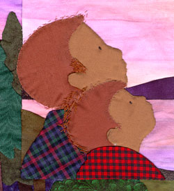
These lips, too, had to look more like they were whistling. Did you realize that in profile whistling lips protrude as far as the nose?
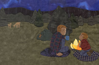
At first it was difficult to rebuild my enthusiasm, but after a few days I was having a wonderful time again. I repaired the faces, replaced the rabbits, added stars and hair to the thirteen nearly finished quilts, then got busy on the last three.
Spreading the finished ones on the studio floor, I choose the fabrics for these daylight pictures. I want to make the ground and foliage lighter than the previous pages, but not brighter than the sky.
By now my technique was well developed.
Placing my drawing face down on a light table I trace it onto a piece of muslin with a fabric marker. These lines will be on the back of the finished piece.
Turning the piece back over, and using the thread line as my guide, I now use a matching thread to sew on the sun and distant hills. Sewing by hand, I turn the edges under with an iron or by using tiny gathering stitches, or simply poking them with my needle.
The last pieces to be sewn on are often the figures, the pieces of which can be very tiny. The tool in the kitty-cornered photo is a small iron which was handy to help turn under these tiny edges.
Here you can see the outline stitches for the top parts of Daddy and Jake. Their pants and shoes are done.
Although I hate the thought of undoing, wishing I'd made a different choice after the book is published is even worse.
I scan the piece along with a few alternate fabrics and do some experimenting in Photoshop. I try dozens of combinations--a dangerously fun and time consuming activity.
When I have myself totally confused, I call in the Frosters for opinions. Betsy says flipping back and forth between the different versions on the computer screen is like playing a difficult game of concentration. In the end we conclude that my first choice is best.
Last I add the details of the faces, fire and stars with embroidery.
Finishing a book is always difficult, and this one was no exception. In fact, since it is easier to undo sewing than it is to undo paint or colored pencil, I kept tinkering longer than I usually do. A few extra sparks maybe? Or sun rays? Yes, that's better. More? No, that's too much. Take it out.
It also didn't help that I really did not want to hand this over to a delivery service. While living in Pennsylvania I delivered most art in person. Could I really trust FedEx to get my precious artwork all the way to New York?
The final stage was cleaning them of stray threads, hairs and lint, which was a bit like trying to sterilize something in an unsterile environment. Piece by piece, I brushed the back, then front, then pressed it from the back on a padded surface. Turning it face up, I used a masking tape lint pick-up for the final cleaning, and carefully placed each between sheets of paper for shipping.
I put them all in a stack, slipped them into a large plastic bag, wrapped them in cardboard, slid the bundle into a box, and shipped them off to New York on Wednesday, February 13, 2002.
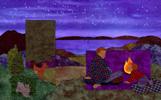
As is often the case, a few came back for "fixes". The only major "fix" was this one. I had silhouetted Jake's face in front of the fire, creating an area of strong contrast to draw the eye. Unfortunately, several people thought it looked like his face was on fire.
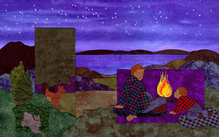
I was able to use what I had learned in Photoshop to pick out parts of the pieces I'd already made and put them together in different ways until I came up with a design--again with the help of my fellow Frosters--that the editor, art director, and I all liked. I finished the jacket and fixes and shipped them on March 20, 2002, along with my notes and photos for the endnotes. A few exchanges and revisions on those and my part of the book was, at last, completed.
Assistant art director, Sylvie LeFloch took over to do a wonderful job of designing and typesetting, and working with production and printers to be sure the colors and reproduction were all we hoped....which brings us to
the end
of the beginning
of a brand new book!